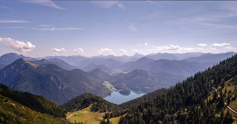
Taking advantage of a very sunny day, I set out around Frankfurt with Lomography 100 in search of anything geometrical. Here are some of the shapes and forms I came across.
Sometimes the best inspiration for photography comes when you are not thinking about it at all. This is exactly what happened to me as I was driving home from one of my early morning rowing sessions on Saturday, I noticed how well lit up the various architectural masterpieces we have in this city were. Then it dawned on me - geometry and shapes! I remembered I had 1 roll of Lomography 100 in the fridge, that would be perfect for a bright spring day.
Here are my favourite shots of a short walkaround of the city with my Leica M6. As usual, all photographs are clickable for full screen viewing.
Geometrical shapes galore in 'My Zeil' shopping centre. This place is great for photography, it has so many cool angles. It also has an escalator (you can see it in the middle with the long red line) that goes from the ground floor to the 4th floor - not good for vertigo!
Really cool architecture, there is a sort of funnel that comes from inside the shopping centre and works its way outside to form part of the ceiling of the centre.
More My Zeil. These were all handheld too, not bad for an ISO 100 film!
Not exactly an architectural shot, but plenty of shapes and I couldn't resist taking the shot. Inside the 'Kleinmarthalle', Frankfurt's old-school and excellent extensive food hall.
This film is really good on bright days, but the super bright blue sky reminds me a bit of the crazy colours of Week 24 with Kodak Colour 200. Otherwise, all other colours seem to render fine.
I'm a sucker for reflection shots. This is off the side of the Deutsche Bank Towers, super clear too.
How very artistic of me, I was drawn by the cool shadow and its symmetry on the bricks. I guess I am better at taking photographs than explaining their artistic value, I just know this is a good shot!
More crazy blue, but really cool geometry too! This film is really good in bright days, all very clear.
More normal blue here. This is the HQ of Deutsche Bank and clearly visible from the airplane approach into Frankfurt. I really like the angle of this shot.
I can see why people say Frankfurt is square! I liked all the square shapes in this shot though. However, what is interesting about this city is the difference between all the new modern architecture and the very old housing and other buildings, might be a good theme for a future post: the contrast of old vs. new.
Loving the reflections. You can see the Main Tower and Commerzbank Tower behind that in this shot, reflecting off the side of the DB Towers.
I really liked how the light was falling in this scene, and I also wanted to test how well this film dealth with such high dynamic range (difference between very bright and very dark areas). Really not bad considering this is a consumer grade film. The scene in reality was much 'punchier' though.
One of the newer office blocks in the city, the green leaves came out a bit dark though. This is probably due to me exposing for the bright blue sky.
Not sure I got the exposure right here, but I really like this shot - it looks very sci-fi!
This has got to be one of the most photographed buildings in Frankfurt. I have plenty of shots too, but mostly in black & white. I couldn't resist taking a colour shot, especially given how bright it was.
Shapes overload! Again, a really bright shot - good work!
A different view of a street sculpture that covers a small footbridge.
I think this shot ended up being too tight, but I liked the overall lines the columns made - I should have given it a bit more breathing space on the right of the shot.
A reflection inside a reflection - starting to remind me of that movie 'Inception'!
The wonderful shapes of the 'Skyline Plaza' shopping centre. I have been meaning to photograph this for a while.
The wavy like exterior changes colour all the way round - very cool! These shots would also work very well in black & white.
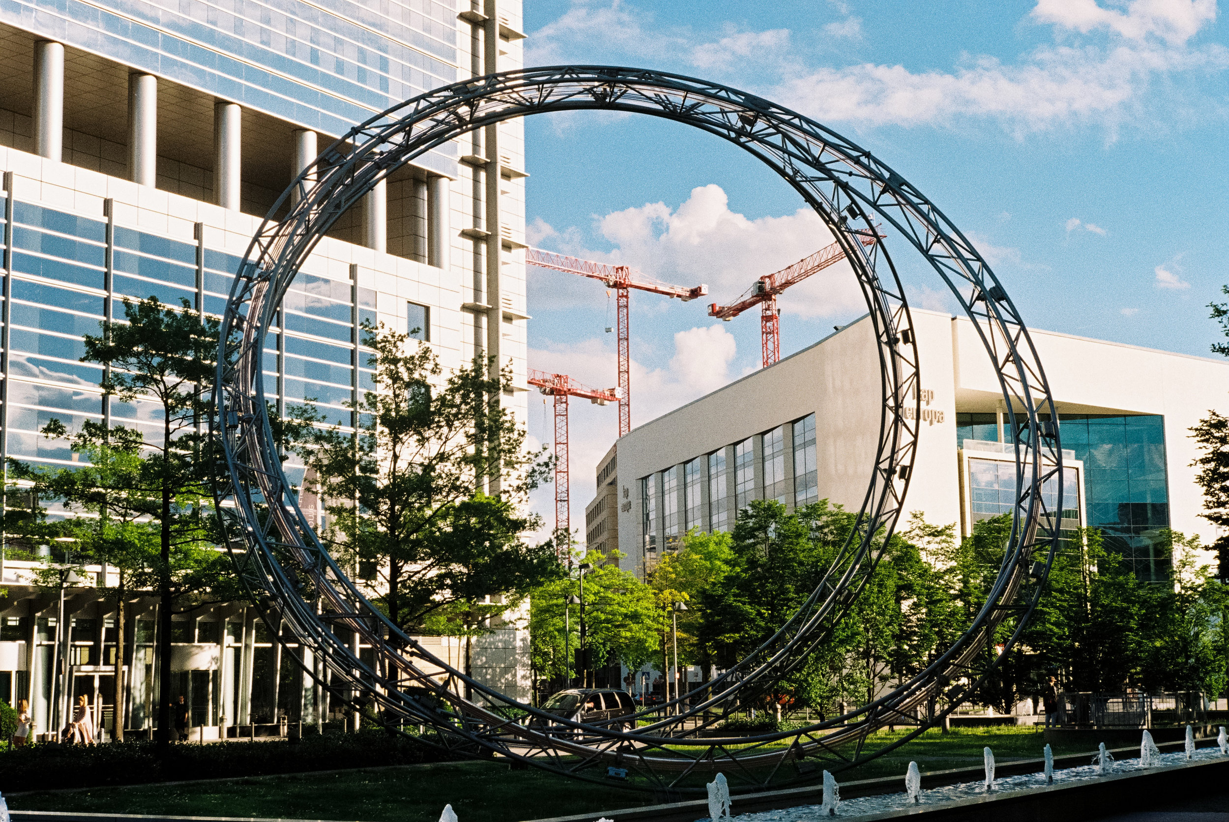
My last shot of the roll and I was trying to get a framed shot of the cranes inside the street sculture (that also has lights and is very colourful at night). Not a bad attempt actually!
Overall impressions
I am a big supporter of Lomography as a company. They have a bit of a movement going on, not only with various films but also cameras and accessories. I have used their range of 100 (this film), 400 (Week 19) and 800 (Week 7) films, as well as their more crazy effects films (remember everything red in Week 8 Lomography Redscale, or everything purple / green in Week 4 Lomography Purple XR). So as you can see they bring plenty of products to the market, usually in affordable packs of 3.
So back to this film: Lomography 100. I have shot it before and have always found it to be a reliable film for bright situations. It doesn't balance the colours as well as Kodak's Ektar 100 on one end, but does a better job than Kodak Colour Plus 200 on the other end. For me, it sits right in the middle as a solid consumer grade film. Perhaps what it lacks is that "film look". The shots are all super clear, but if I want really good colour balance I go for Kodak Ektar. That being said, given its price range and reliability, I will certainly have a 3-pack of this in the fridge for bright summer days.
So as you can see, inspiration for photography comes when you least expect it, another good reason to always have a camera with you (and if it is a film camera, even better!).
As always, I continue to plan for the week's ahead and my photography shooting has gone a bit ahead of the development, so there are most posts coming soon. And plenty to look forward to, including Rollei RPX films (100 and 400) and the limited Lomography f2/400.
See you soon!
Neil